Client: BeachBubs, a vibrant kids beachwear brand.
Objective: To craft a playful and memorable logo that encapsulates the joy of childhood beach adventures.
Design Philosophy:
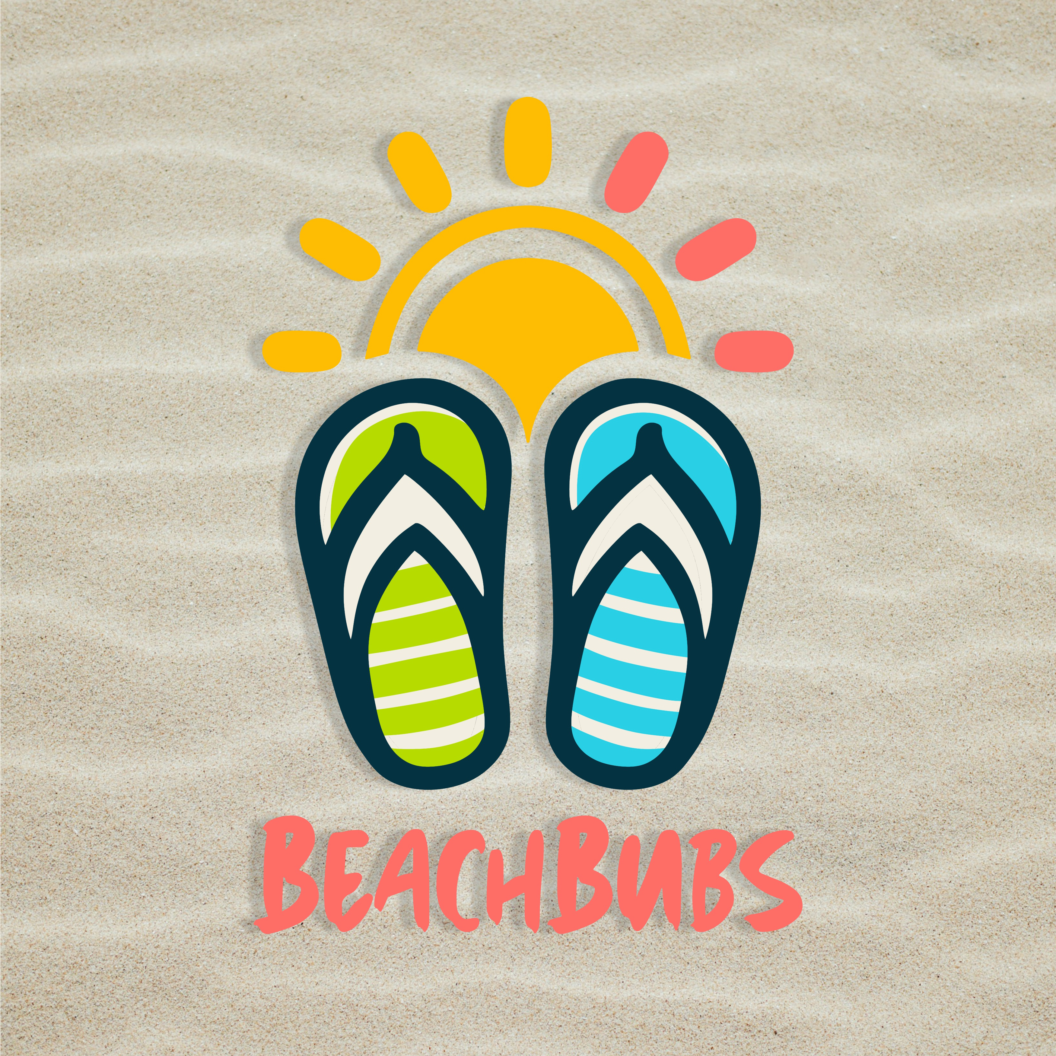
The essence of the BeachBubs logo is encapsulated in the joy and simplicity of a child’s day at the beach. At the heart of the design are a pair of stylized flip-flops, chosen for their universal association with beachwear and leisure. These flip-flops, adorned with cheerful stripes and lively patterns, convey the brand’s focus on fun designs and comfort for children.
Overarching the flip-flops is a radiant sun symbol, the quintessential emblem of outdoor fun and vibrancy. Its rounded form and bright colors embody the energy and warmth that BeachBubs aims to bring to its young clientele.
Typography is used to convey a sense of informality and approachability, key attributes that the brand identifies with. The custom lettering is playful yet readable, inviting both children and parents to connect with the brand’s friendly persona. The color palette is intentionally chosen to be vivid and appealing to kids, featuring shades that remind one of the joys of summer.
Flexibility: The logo is designed to stand out and maintain its playful character across various backgrounds and applications, ensuring that whether it is on a tag or online, the essence of BeachBubs is clearly communicated.
Conclusion:
With its engaging design and energetic colors, the BeachBubs logo is a visual statement of the brand’s commitment to making beach time playful and stylish for children. It reflects the company’s ethos of creating products that are as durable and comfortable as they are fun, capturing the spirit of youthful beach adventures.